


The AI-Powered KPI Performance Diagram Builder, developed by Visual Paradigm, is a web-based tool that transforms traditional spreadsheet-based business strategies into interactive, visual diagrams. It allows users to map Initiatives, Metrics, and Key Performance Indicators (KPIs), revealing cause-and-effect relationships to support better decision-making, planning, and analysis.
This guide covers key concepts, step-by-step usage, features, examples, use cases, tips, and a summary.
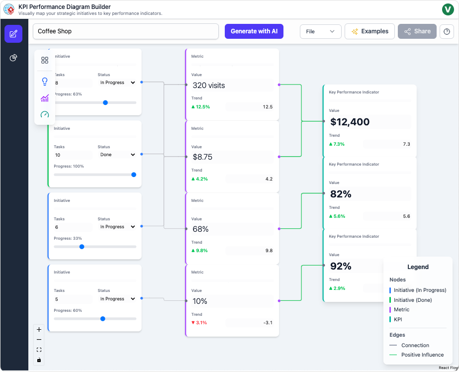
This screenshot is from the AI-Powered KPI Performance Diagram Builder by Visual Paradigm. The diagram is titled “Coffee Shop”, illustrating a visual strategy map for a coffee shop business. It uses a flow-based layout with nodes (boxes) and directed connections (green lines) to show cause-and-effect relationships between strategic elements.
The diagram is structured in three columns from left to right:
- Left column: Initiatives (strategic actions/projects, colored blue).
- Middle column: Metrics (measurable tracking values, colored purple).
- Right column: Key Performance Indicators (KPIs) (critical business outcomes, colored dark purple).
Legend (bottom right):
- Nodes: Initiative (In Progress) in blue, Initiative (Done) in green, Metric in purple, KPI in dark purple.
- Edges: Green = Positive Influence, (no negative shown in this diagram).
Specific nodes and connections:
Initiatives (left side, from top to bottom):
- Top: Initiative with 8 Tasks, Status: In Progress, Progress: 83%.
- Second: Initiative with 10 Tasks, Status: Done, Progress: 100% (green border indicating completion).
- Third: Initiative with 6 Tasks, Status: In Progress, Progress: 33%.
- Bottom: Initiative with 5 Tasks, Status: In Progress, Progress: 60%.
Metrics (middle, connected from initiatives):
- 320 visits (Value), Trend ▲12.5% (green up arrow).
- $8.75 (Value), Trend ▲4.2% (green).
- 68% (Value), Trend ▲9.8% (green).
- 10% (Value), Trend ▼ -3.1% (red down arrow) — the only negative trend.
KPIs (right side):
- $12,400 (likely Monthly Revenue or similar), Trend ▲7.3% (green).
- 82% (possibly Customer Satisfaction or Retention), Trend ▲5.6% (green).
- 92% (possibly another high-level success metric), Trend ▲2.9% (green).
Connections: Green lines flow from initiatives → metrics → KPIs, showing how completed/in-progress actions positively influence metrics, which in turn drive the KPIs.
Additional UI elements:
- Top bar: “Generate with AI” button, File/Examples/Share menus.
- Left sidebar: Tools for adding nodes/connections.
- Bottom: Reset button.
Interpretation
This diagram represents a cause-and-effect strategy map for a coffee shop’s performance, similar to a Balanced Scorecard or OKR framework but focused on Initiatives → Metrics → KPIs.
- Positive Overall Performance: Most trends are upward (green arrows), indicating improvement. KPIs show solid growth: revenue-like figure up 7.3%, satisfaction/retention metrics at high levels (82% and 92%) with positive trends.
- Impact of Initiatives: Completed initiatives (e.g., the 100% done one) likely contribute strongly to positive metrics like visits (+12.5%) and average spend (+4.2%).
- Areas of Concern: The bottom metric at 10% with a -3.1% decline (red) could represent something like complaint rate, waste percentage, or staff turnover — a potential bottleneck dragging down performance despite other gains.
- Progress Tracking: Initiatives are at various stages (33% to 100%), with task counts, allowing managers to monitor execution.
- Strategic Insight: The visual flow clarifies how tactical actions (initiatives) drive operational measures (metrics), ultimately impacting key business results (KPIs). For a coffee shop, common interpretations might include initiatives like “Staff Training” or “Marketing Campaigns” leading to higher foot traffic/visits and spend, boosting revenue and loyalty.
This tool makes abstract strategy tangible, highlighting dependencies, progress, and trends at a glance for better decision-making (e.g., prioritize fixing the declining metric).
Key Concepts
The tool centers on visual mapping of business performance through nodes and connections:
- Initiatives: Strategic actions, projects, or activities designed to drive change (e.g., “Launch New Marketing Campaign” or “Improve Employee Training”).
- Metrics: Measurable aspects of performance that track progress (e.g., “Website Traffic” or “Employee Satisfaction Score”).
- KPIs (Key Performance Indicators): Critical, quantifiable measures of success tied to business objectives (e.g., “Revenue Growth” or “Customer Retention Rate”).
- Connections: Directed links between nodes that illustrate cause-and-effect relationships. For example, an Initiative might improve a Metric, which in turn positively impacts a KPI. These connections form a flow map showing how actions cascade to outcomes.
- Cause-and-Effect Mapping: The core principle—diagrams act as strategy maps (similar to Balanced Scorecard or OKR frameworks) to clarify how tactical initiatives drive strategic results, identify bottlenecks, and highlight dependencies.
The AI enhances this by generating structures, suggesting connections, and providing automated insights.
How to Use the Tool: Step-by-Step
- Generate or Build Your Diagram
- Start a new diagram by entering a business domain (e.g., “E-commerce Retail” or “Software Development Team”).
- The AI auto-generates a complete structure with relevant Initiatives, Metrics, KPIs, and logical connections.
- Alternatively, begin with a blank canvas and manually drag-and-drop nodes.
- Add, Connect, and Edit Nodes
- Drag nodes onto the canvas.
- Click to edit details: rename, add descriptions, assign weights (for impact prioritization), or adjust properties.
- Draw connections between nodes to define cause-and-effect flows.
- Select a node and request AI suggestions for high-impact additions or auto-links.
- Analyze with the AI Insights Suite
- Switch to the Insights dashboard.
- Generate reports automatically:
- Executive Summary: High-level overview for stakeholders.
- Performance Analysis: Detailed breakdowns and bottleneck detection.
- Strategic & Risk Reports: Actionable recommendations and threat identification.
- Team Deep-Dive: Focused analysis on specific initiatives.
- Switch AI models (e.g., Gemini or GPT) for varied analytical perspectives.
- Save, Export, and Share
- Save to secure cloud storage for future access.
- Export as PNG (for presentations), JSON (for data), or other formats.
- Generate shareable, read-only links for collaboration.
The drag-and-drop canvas includes auto-layout for clarity during editing.
Detailed Features
- AI-Generated Diagrams — Instant full maps from a simple domain prompt.
- Intelligent Suggestions — Context-aware recommendations to accelerate building.
- Advanced Insights Suite — AI-powered reporting for summaries, deep-dives, risks, and recommendations.
- Flexible AI Models — Toggle between providers like Gemini and GPT.
- Effortless Editing — Intuitive interactions with real-time updates.
- Sharing & Storage — Cloud-based saving, exports, and link sharing.
Examples
The tool produces flow-based diagrams similar to strategy maps, where initiatives feed into metrics, which drive KPIs.
Hypothetical Example: E-commerce Business
- Initiative: “Optimize Website UX” → connects to Metric: “Bounce Rate Reduction” → connects to KPI: “Increase Conversion Rate by 15%”.
- AI might suggest adding “A/B Testing Program” as a linked initiative and “Average Session Duration” as a supporting metric.
- Insights could flag “Slow Page Load Time” as a bottleneck risk.
Hypothetical Example: Software Team
- Initiative: “Adopt Agile Practices” → Metric: “Sprint Velocity” → KPI: “On-Time Delivery Rate”.
- AI-generated insights might recommend focusing on “Code Review Efficiency” to reduce risks.
Use Cases
- Business Leaders → Visualize how actions impact bottom-line results for strategic alignment.
- Project Managers → Track progress by connecting initiatives to benchmarks and KPIs.
- Analysts → Uncover dependencies and bottlenecks for data-driven recommendations.
Tips & Best Practices
- Group related nodes (e.g., by department or theme) for visual clarity.
- Leverage AI suggestions to discover non-obvious connections or root causes.
- Use auto-layout frequently to maintain readability as diagrams grow.
- Export regularly for backups, presentations, or archival.
- Experiment with different AI models for diverse insights.
Summary
The AI-Powered KPI Performance Diagram Builder turns complex business strategies into clear, actionable visual maps. By combining intuitive drag-and-drop editing with powerful AI for generation, suggestions, and insights, it empowers users to clarify cause-and-effect, detect issues early, and collaborate effectively. Ideal for leaders, managers, and analysts, this tool accelerates planning and drives performance through visualization. Access it via Visual Paradigm’s online platform to start transforming your strategies today.
