


Introduction
Data visualization is essential for . Traditional charts like bar and line graphs often fall short when comparing multiple variables simultaneously. Radar Charts (also known as Spider or Web Charts) excel at visualizing multi-dimensional data, making them ideal for performance analysis, skill assessments, and product comparisons.
Visual Paradigm Desktop’s AI Diagram Generator now supports AI-Powered Radar Chart Generation, enabling users to create these charts instantly from a simple text prompt. This tutorial will guide you through the key concepts, step-by-step process, practical examples, and best practices for leveraging this powerful tool.
Key Concepts
What is a Radar Chart?
A Radar Chart is a graphical method for displaying multivariate data in the form of a two-dimensional chart with three or more quantitative variables represented on axes starting from the same point. It is particularly useful for:
- Comparing performance across multiple metrics.
- Identifying strengths, weaknesses, and gaps.
- Visualizing profiles (e.g., employee skills, product features).
Why Use AI for Radar Charts?
- Complexity: Manually plotting multiple axes is time-consuming and error-prone.
- Clarity: Traditional tables often obscure patterns and overall profiles.
- Efficiency: AI automates the process, saving time and ensuring accuracy.
Common Use Cases
- Performance Analysis: Compare .
- Skill Assessments: Evaluate employees across multiple competencies.
- Product Comparisons: Analyze products based on features like price, quality, and usability.
Step-by-Step Guide to Generating a Radar Chart
Prerequisites
- Install or update Visual Paradigm Desktop to the latest version.
- Ensure you have the Professional Edition or higher.
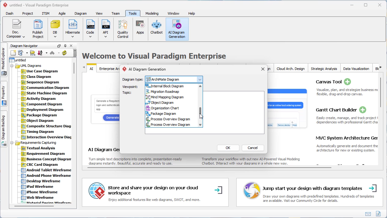
Step 1: Launch the AI Diagram Generator
- Open Visual Paradigm Desktop.
- Click on Tools in the toolbar.
- Select AI Diagram Generation.
Step 2: Choose the Radar Chart Option
- From the Diagram Type Menu, select Radar Chart.
Step 3: Enter Your Topic
- Provide a textual description of what you want to visualize. For example:
- “Compare three products (A, B, C) based on price, quality, usability, and customer support.”
- “Evaluate an employee’s performance across communication, teamwork, problem-solving, and leadership.”
Step 4: Customize Your Chart
- Define the number of spokes (axes) and their labels.
- Specify the data values for each variable.
- Use natural language to refine the chart (e.g., “Add a fourth axis for innovation”).
Step 5: Generate and Refine
- The AI will instantly generate a Radar Chart based on your input.
- Adjust colors, labels, and scaling as needed.
- Export the chart for reports or presentations.
Practical Examples
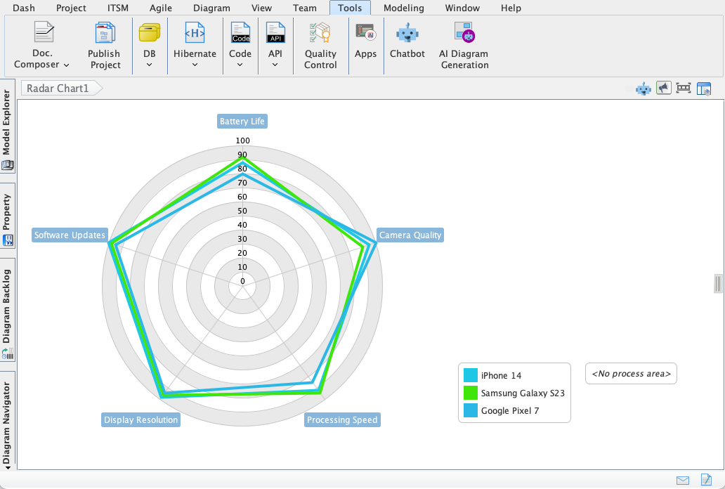
Example 1: Product Comparison
Prompt: “Compare Product A, Product B, and Product C across five features: Price (1-10), Quality (1-10), Usability (1-10), Customer Support (1-10), and Innovation (1-10).”
Output: A Radar Chart with five axes, each representing a feature. The chart will visually highlight which product excels in which area.
Example 2: Employee Performance
Prompt: “Assess John’s performance in Communication (8), Teamwork (7), Problem-Solving (9), Leadership (6), and Creativity (8).”
Output: A Radar Chart showing John’s strengths (Problem-Solving) and areas for improvement (Leadership).
Best Practices for Effective Radar Charts
-
:
- Too many axes can clutter the chart. Stick to 4-8 variables for clarity.
-
:
- Ensure all axes use the same scale (e.g., 1-10) for accurate comparisons.
-
Highlight Key Insights:
- Use colors to differentiate between data sets (e.g., actual vs. target performance).
-
Keep It Simple:
- Avoid overcrowding the chart with excessive data points.
-
Label Clearly:
- Ensure axes and data points are labeled for easy interpretation.
Troubleshooting Common Issues
| Issue | Solution |
|---|---|
| Chart appears distorted | Check if all axes use the same scale. |
| Data points overlap | Reduce the number of variables or adjust scaling. |
| AI misinterprets the prompt | Refine your description with clearer metrics and comparisons. |
Summary
- Radar Charts are ideal for visualizing multi-dimensional data.
- Visual Paradigm’s AI Diagram Generator automates the creation process, saving time and reducing errors.
- Customization is easy with .
- Best practices include limiting axes, consistent scaling, and clear labeling.
Conclusion
The AI-Powered Radar Chart feature in Visual Paradigm Desktop empowers users to transform complex data into clear, actionable visuals. Whether you’re analyzing performance, comparing products, or assessing skills, this tool provides instant clarity and deeper insights.
Ready to try it out? and start generating Radar Charts in seconds!
