


Introduction
In today’s fast-paced business environment, the ability to quickly transform raw data into meaningful visualizations is crucial for effective decision-making. Visual Paradigm’s AI Diagramming Chatbot represents a significant advancement in this space, allowing users to generate professional charts through natural language prompts. However, creating a chart is only half the battle—integrating these visualizations into your broader workflow and making them accessible across your organization is equally important.
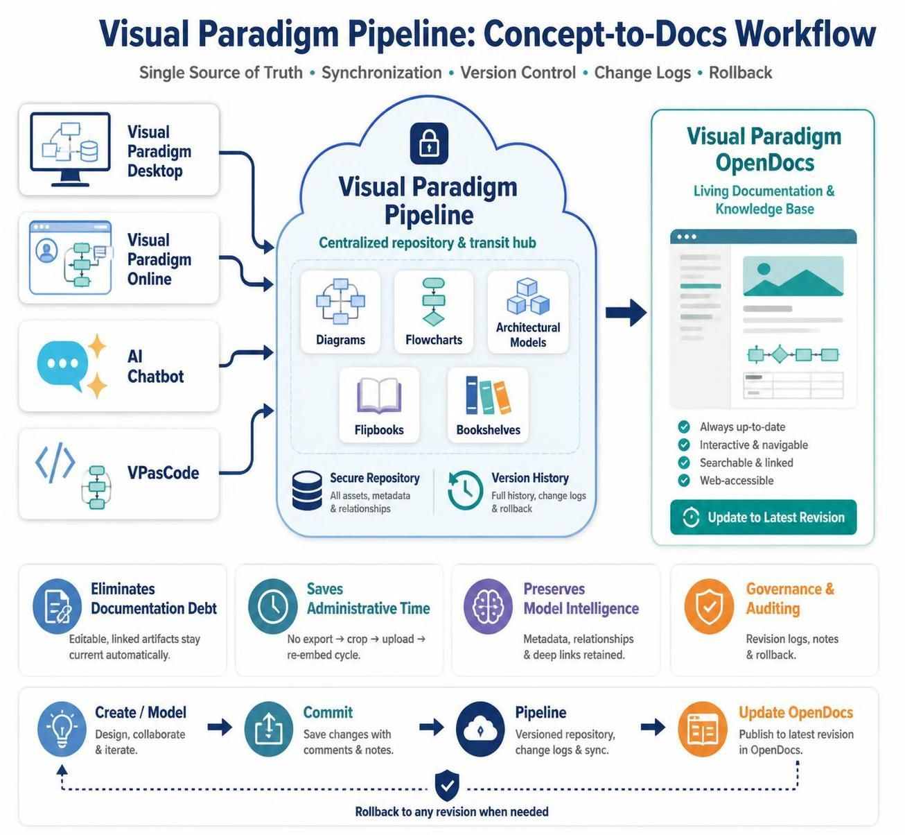
This comprehensive guide walks you through the process of generating charts using Visual Paradigm’s AI capabilities and seamlessly transferring them to Pipeline, Visual Paradigm’s cloud-based collaboration platform. Whether you’re a product manager like Angus who regularly needs to present data insights, or any professional looking to streamline their visualization workflow, this guide will help you maximize the value of AI-generated charts within your organization’s ecosystem.
Key Concepts
Understanding the Components
Visual Paradigm AI Diagramming Chatbot: An intelligent assistant that interprets natural language descriptions and converts them into professional diagrams and charts. It supports various chart types including column charts, line graphs, pie charts, and more.
ECharts: The underlying visualization library used by Visual Paradigm to render interactive, web-based charts. ECharts provides rich customization options and responsive design capabilities.
Pipeline: Visual Paradigm’s cloud storage and collaboration platform that serves as a central repository for diagrams, charts, and other visual assets. Pipeline enables team members to access, share, and collaborate on visual content across different Visual Paradigm applications.
Benefits of the AI-to-Pipeline Workflow
-
Speed: Generate complex charts in seconds rather than hours
-
Consistency: Maintain uniform styling and formatting across all organizational charts
-
Accessibility: Make charts available to team members regardless of their location or device
-
Collaboration: Enable multiple stakeholders to view, comment on, and utilize the same visualizations
-
Integration: Seamlessly incorporate charts into larger diagrams, reports, and presentations
Step-by-Step Guide: From AI Generation to Pipeline Storage
Step 1: Access the AI Diagramming Chatbot
Begin by opening the Visual Paradigm AI Diagramming Chatbot. This web-based interface serves as your gateway to AI-powered diagram generation. Ensure you’re logged in with your Visual Paradigm credentials to enable full functionality, including the ability to save work to Pipeline.
Step 2: Craft Your Chart Request
The quality of your AI-generated chart depends largely on how clearly you communicate your requirements. You can approach this in several ways:
Option A: Provide Raw Data
Describe the chart type and paste your dataset directly into the prompt. For example:
Create a column chart showing employee headcount by department.
Data: Engineering: 45, Marketing: 23, Sales: 31, HR: 12, Finance: 18
Option B: Describe the Information
Explain what you want to visualize without providing exact numbers:
Generate a pie chart showing market share distribution among top 5 competitors in the cloud services industry
Option C: Specify Chart Type and Context
Combine chart specifications with contextual information:
Create a line graph tracking monthly revenue growth over the past year for a SaaS company, showing an upward trend from $50K to $120K
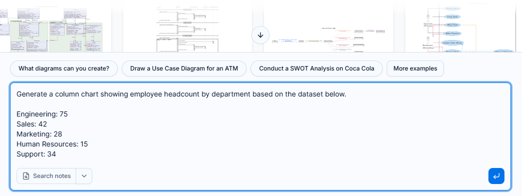
Figure 1: Providing raw data to the AI Diagramming Chatbot for chart generation
Step 3: Wait for Chart Generation
After submitting your prompt, the AI processes your request and generates the appropriate EChart. This typically takes just a few seconds. During this time, the system analyzes your input, determines the optimal chart type (if not specified), applies appropriate formatting, and renders the visualization.
Step 4: Review the Generated Chart
Once generated, the chart appears in the diagram viewer. Take time to review:
-
Accuracy: Does the chart correctly represent your data?
-
Clarity: Are labels, legends, and titles clear and readable?
-
Aesthetics: Is the color scheme appropriate and visually appealing?
-
Completeness: Are all necessary data points included?
If adjustments are needed, you can refine your prompt and regenerate the chart, or proceed to manual editing if minor tweaks are required.
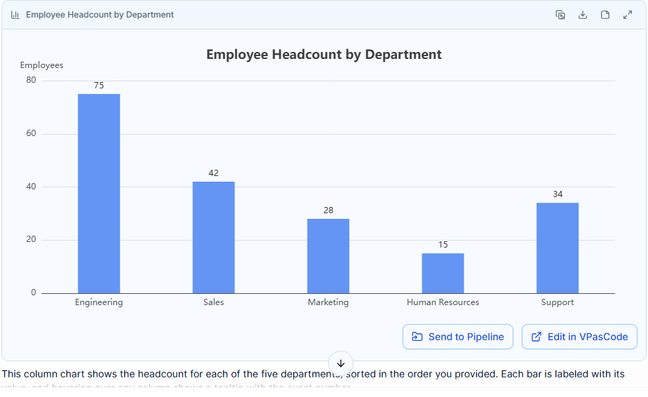
Figure 2: Example of a column chart generated by the AI Diagramming Chatbot
Step 5: Initiate Transfer to Pipeline
When you’re satisfied with the chart, locate the “Send to Pipeline” button at the bottom of the diagram viewer. This action initiates the transfer process, preparing your chart for storage in Visual Paradigm’s cloud platform.

Figure 3: The “Send to Pipeline” button for transferring charts to cloud storage
Step 6: Name Your Chart
A dialog box will appear prompting you to enter a name for the diagram. Choose a descriptive, searchable name that will help you and your team locate the chart later. Good naming conventions include:
-
Specific: “Q3 2026 Employee Headcount by Department”
-
Contextual: “Market Share Analysis – Cloud Services Industry”
-
Project-related: “Sprint Velocity Trend – Project Phoenix”
Avoid generic names like “Chart 1” or “My Graph,” as these become difficult to find in a growing repository.
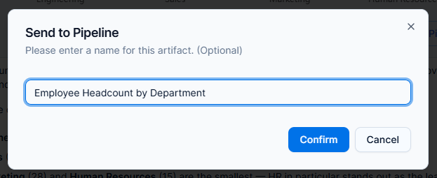
Figure 4: Naming the chart before confirming transfer to Pipeline
Step 7: Confirm and Complete
Click “Confirm” to finalize the transfer. The chart is now stored in your Pipeline account and can be accessed from any supported Visual Paradigm application. You’ll receive confirmation once the transfer is complete.
Practical Examples
Example 1: Product Management Dashboard
As a Product Manager, you might need to visualize feature adoption rates:
Prompt:
Create a stacked bar chart showing feature adoption rates across user segments.
Enterprise Users: Basic Features 85%, Advanced Features 62%, Premium Features 34%
SMB Users: Basic Features 92%, Advanced Features 45%, Premium Features 18%
Individual Users: Basic Features 97%, Advanced Features 28%, Premium Features 8%
Use Case: Include this chart in quarterly product reviews stored in Pipeline, accessible to stakeholders across engineering, marketing, and executive teams.
Example 2: Financial Reporting
For financial analysis and budget planning:
Prompt:
Generate a line chart showing monthly operating expenses for the past 12 months.
Jan: $125K, Feb: $128K, Mar: $132K, Apr: $130K, May: $135K, Jun: $138K,
Jul: $142K, Aug: $140K, Sep: $145K, Oct: $148K, Nov: $150K, Dec: $155K
Use Case: Store in Pipeline for easy integration into annual reports and board presentations.
Example 3: Team Performance Metrics
Track team productivity and sprint outcomes:
Prompt:
Create a grouped column chart comparing story points completed vs. planned across last 6 sprints.
Sprint 1: Planned 45, Completed 42
Sprint 2: Planned 50, Completed 48
Sprint 3: Planned 48, Completed 51
Sprint 4: Planned 52, Completed 49
Sprint 5: Planned 50, Completed 53
Sprint 6: Planned 55, Completed 54
Use Case: Share with development teams via Pipeline for retrospective meetings and capacity planning.
Best Practices
Crafting Effective Prompts
-
Be Specific: Clearly state the chart type if you have a preference
-
Provide Context: Explain what the data represents
-
Format Data Clearly: Use consistent delimiters and structure
-
Include Units: Specify measurement units (dollars, percentages, counts)
-
Request Styling: Mention color preferences or branding requirements if needed
Organizing Charts in Pipeline
-
Use Folders: Create logical folder structures (by project, department, or time period)
-
Tag Appropriately: Add relevant tags for easier searching
-
Version Control: Use descriptive names that indicate version or date
-
Set Permissions: Configure access levels based on sensitivity and audience
Maintaining Chart Quality
-
Verify Data Accuracy: Always double-check that the AI interpreted your data correctly
-
Update Regularly: Regenerate charts when underlying data changes
-
Standardize Formats: Establish organizational standards for chart types and styling
-
Document Sources: Keep track of data sources for audit and verification purposes
Integration with Visual Paradigm Applications
Once your charts are in Pipeline, they become accessible across the Visual Paradigm ecosystem:
-
Visual Paradigm Desktop: Import charts directly into diagrams, reports, and presentations
-
Web Applications: Embed charts in online documentation and collaborative spaces
-
Mobile Apps: Access charts on-the-go for meetings and presentations
-
Team Collaboration: Share charts with team members who can view, comment, and utilize them in their own work
This integration ensures that your AI-generated visualizations don’t exist in isolation but become part of your organization’s knowledge base and decision-making infrastructure.
Conclusion
The workflow of generating charts with Visual Paradigm’s AI Diagramming Chatbot and sending them to Pipeline represents a powerful combination of artificial intelligence and cloud collaboration. By following the steps outlined in this guide, you can dramatically reduce the time spent on data visualization while ensuring that your charts are professionally formatted, easily accessible, and integrated into your broader workflow.
For professionals like Angus, who balance multiple responsibilities and need to communicate data insights effectively, this streamlined process offers significant value. The ability to quickly generate accurate, visually appealing charts and make them available to stakeholders across the organization enhances both individual productivity and team collaboration.
As AI continues to evolve, tools like Visual Paradigm’s AI Diagramming Chatbot will become increasingly sophisticated, offering even more intuitive ways to transform data into insights. By mastering this workflow now, you position yourself to take full advantage of future enhancements while establishing best practices that will serve you well in the evolving landscape of data visualization and business intelligence.
Start experimenting with different chart types and data sets today, and discover how AI-powered visualization can transform the way you communicate insights and drive decisions in your organization.

 English
 Arabic
 Chinese (Simplified)
 Dutch
Dutch French
 German
 Italian
 Japanese
 Korean
 Portuguese
 Russian
 Spanish