


Introduction
In today’s data-driven world, the ability to transform raw numbers into compelling visual stories is an essential skill. Whether you’re a business analyst presenting quarterly results, a developer monitoring application performance, or a student working on a research project, charts and graphs are powerful tools that make complex information accessible and understandable.
However, traditional chart creation tools often require extensive manual work, technical expertise, or expensive software licenses. What if you could create professional, interactive charts using simple text descriptions? What if artificial intelligence could generate your first draft, and you could refine it with code when precision matters?
This comprehensive guide introduces you to a revolutionary approach to data visualization: combining AI-powered chatbot assistance with the flexibility of code-based chart editing. You’ll learn how to use Visual Paradigm’s AI Chatbot to instantly generate charts from natural language descriptions, and then refine them using Visual Paradigm VPasCode—a powerful diagram-as-code platform that supports Apache ECharts, one of the most versatile charting libraries available today.
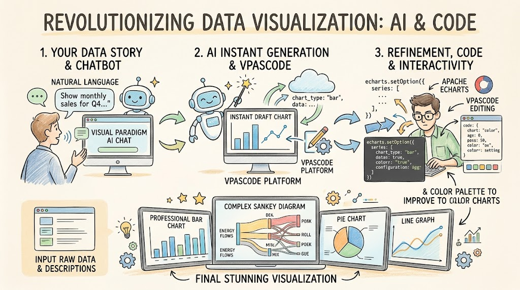
By the end of this guide, you’ll have the knowledge and confidence to create stunning visualizations for any scenario, from simple bar charts showing monthly sales to complex Sankey diagrams tracking energy flows across multiple systems.
Understanding the Modern Chart Creation Workflow
The Challenge with Traditional AI Chart Generators
Have you ever used an AI chart maker to build a visual, only to realize the data was slightly off or the colors didn’t match your brand? While AI chart generation is incredibly powerful for brainstorming and getting a quick head start, static AI results often fall short when it’s time to present to your team or clients. In the real world, you need the flexibility to edit, refine, and update your data to match your exact scenario.
The Complete Workflow: Create with AI Chatbot, Edit with VPasCode
A truly useful AI chart maker shouldn’t just hand you a static picture and leave you stuck. With Visual Paradigm’s all-in-one ecosystem, you get a seamless, flexible AI chart generation workflow that gives you the best of both worlds:
- Instant Ideation: Ask the AI Chatbot to generate the chart type you need to jumpstart your design.
- Total Control: Instantly open the generated chart in VPasCode, a diagram-as-code editor. From there, you can freely edit the raw data, tweak the values, and fully customize the style—such as switching colors to match your brand—to make it entirely your own.
Instead of recreating charts from scratch just because a single number changed, this AI chart generator gives you the perfect starting point, and the exact tools you need to finish the job.
Getting Started with VPasCode
What is VPasCode?
VPasCode is a unified text-to-diagram platform designed to eliminate the friction of shifting between multiple drawing tools. By supporting popular syntax options like Mermaid, PlantUML, and Graphviz within a single, integrated developer environment, VPasCode has quickly become a go-to ecosystem for quick, precise diagram rendering.
Recently, VPasCode introduced native support for Apache ECharts, transforming the diagramming environment into a highly flexible, code-driven chart maker. You can now transform your JSON configurations or AI-assisted descriptions into rich, interactive data visualizations in real time.
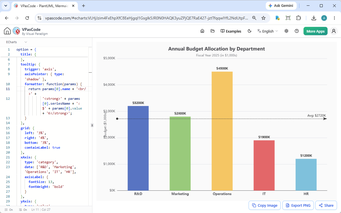
With the side-by-side interface, the mechanics remain simple and intuitive: input your ECharts configuration object on the left panel, and your interactive dashboard components render seamlessly on the right panel.
Why Choose VPasCode as Your Chart Generator?
While standard static charting software forces you to drag, drop, and manually adjust individual pixels, VPasCode relies completely on structured code. Integrating ECharts unlocks distinct advantages for modern technical teams:
- Unified Architecture: Switch effortlessly between application architecture blueprints (via PlantUML/Mermaid) and data analytics dashboards (via ECharts) within the same tab.
- AI-Driven Workflows: Leverage the platform as an intelligent AI chart generator. Describe your data requirements natively (in the AI Diagramming Chatbot), and see accurate visualizations built automatically without manual styling.
- Highly Sharable States: Every diagram configuration is compressed into a unique, shareable URL, making it incredibly easy to collaborate on code reviews, wiki documentation, or live client presentations.
Introduction to ECharts
What is Apache ECharts?
Apache ECharts is a powerful, open-source visualization library that provides intuitive, interactive, and highly customizable charts. It’s built on JavaScript and uses HTML5 Canvas for rendering, which means your charts will be smooth, fast, and work across all modern browsers.
Key Concepts for Beginners
1. The Option Object
Every ECharts chart is defined by a configuration object called option. This JavaScript object contains all the settings for your chart, including:
- Data values
- Chart type
- Colors and styles
- Axes configuration
- Tooltips and interactions
2. Series
The series array is where you define what type of chart you want (bar, line, pie, etc.) and provide the actual data. Each series can have different properties like:
type: The chart type (e.g., ‘bar’, ‘line’, ‘pie’)data: Your datasetname: A label for the legend
3. Axes
For most charts, you’ll configure:
xAxis: The horizontal axis (categories or values)yAxis: The vertical axis (values or categories)
4. Tooltip
Tooltips appear when users hover over chart elements, showing detailed information about specific data points.
Using the AI Chatbot for Instant Chart Generation
Accessing the AI Chatbot
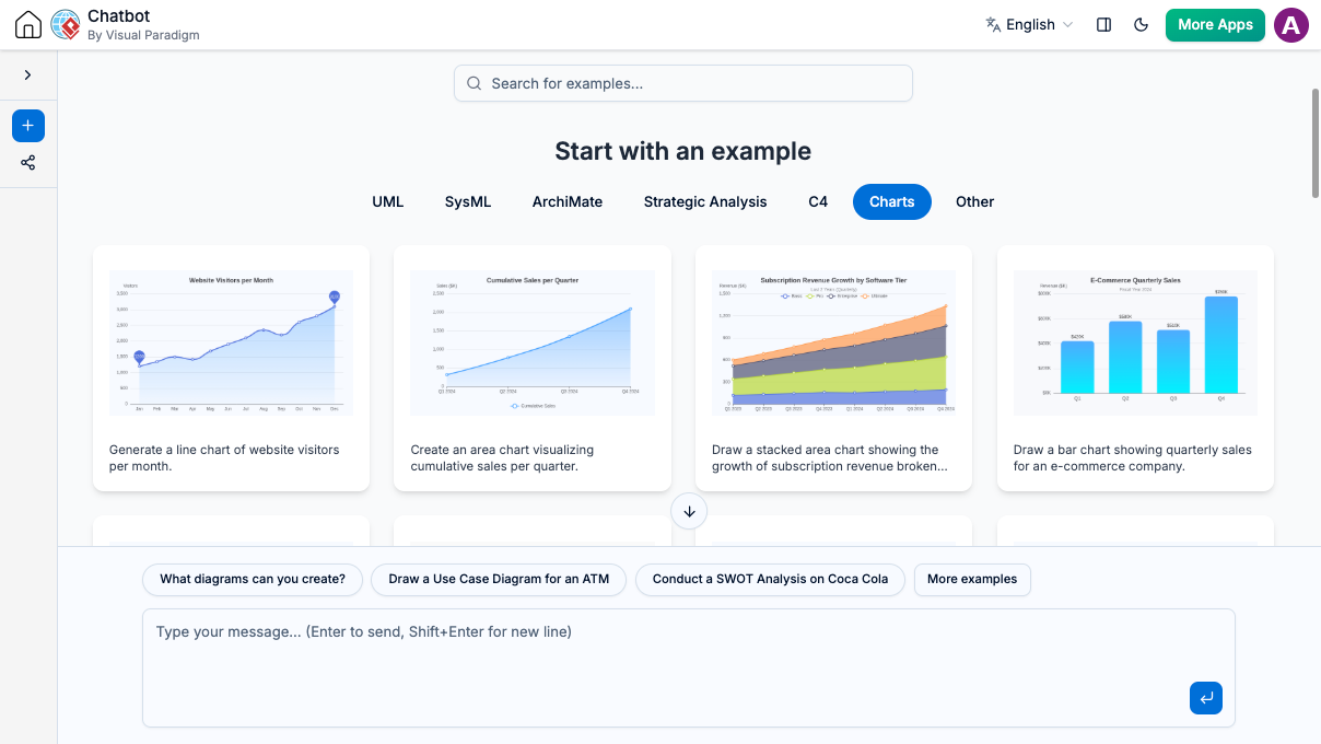
The AI Chatbot is your gateway to instant chart creation. Simply visit the AI Toolbox and start with a simple request. No coding knowledge required—just describe what you want to visualize in plain English.
Crafting Effective Prompts
The key to getting great results from the AI Chatbot is writing clear, specific prompts. Here’s the formula:
Basic Structure:
“Generate a [chart type] showing [what you’re measuring] by [categories/time periods]”
Examples:
- “Generate a bar chart for monthly website traffic”
- “Create a pie chart showing market share of top 5 smartphone brands”
- “Generate a line chart of website visitors per month”
Sample Workflow
Let’s walk through a complete example:
Step 1: Start with a Prompt
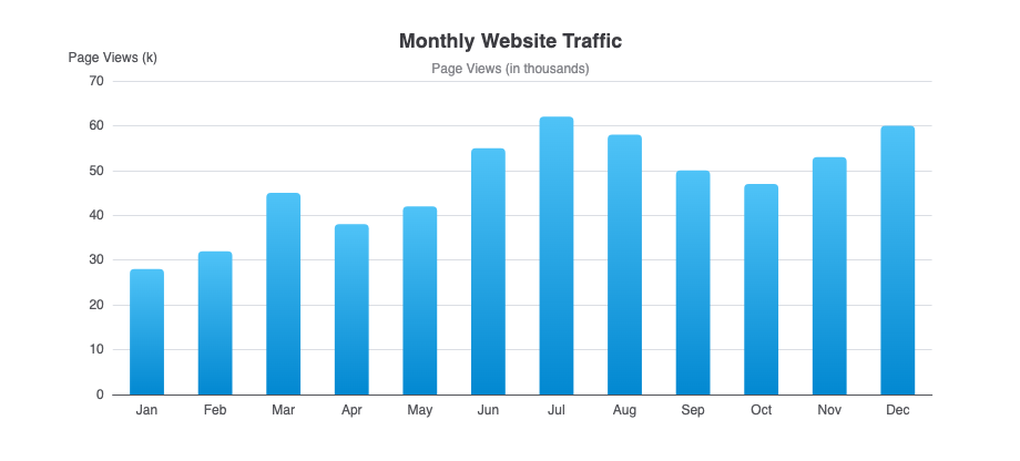
Type: “Generate a bar chart for monthly website traffic”
Step 2: Review the Generated Chart
The chatbot will create a chart with sample data. Review it to ensure it has the right structure.
Step 3: Open in VPasCode
Click to open the chart in the VPasCode editor where you can:
- Replace sample data with your actual numbers
- Change colors to match your brand
- Adjust labels and formatting
- Add interactivity features
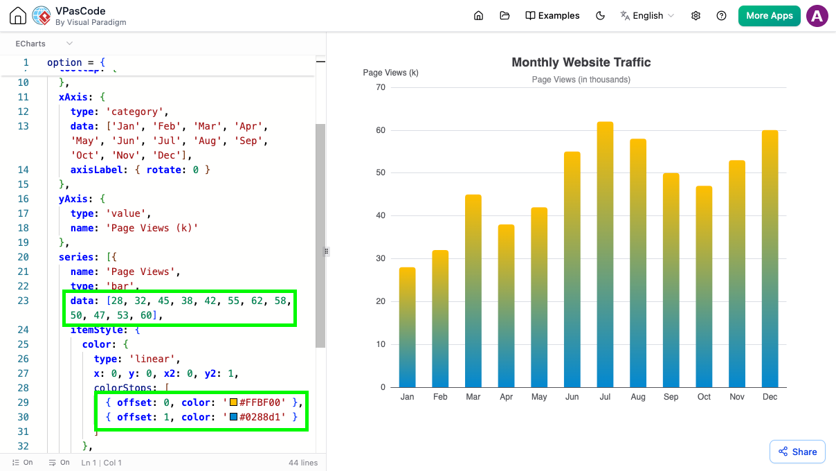
Step 4: Customize and Export
Make your edits and share the final result via URL or export it for presentations.
Chart Types and Use Cases
Our AI chart generation tool can now create a massive variety of layouts directly from your text prompts. Let’s explore the different chart types and when to use each one.
Classic Formats
Line Charts
Best For: Showing trends over time, tracking changes, comparing multiple data series
Sample Prompt: “Generate a line chart of website visitors per month”
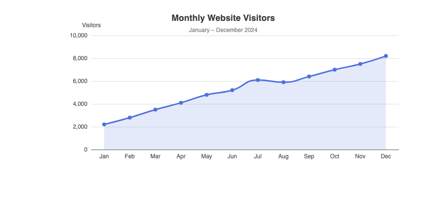
Line charts excel at displaying continuous data and are perfect for showing growth patterns, seasonal trends, or performance metrics over time.
Area Charts
Best For: Visualizing cumulative totals, showing volume changes, emphasizing magnitude
Sample Prompt: “Generate an area chart visualizing cumulative sales per quarter”
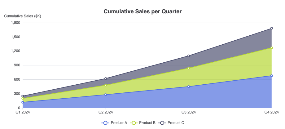
Area charts are like line charts but with the area below the line filled in, making them ideal for showing how different parts contribute to a whole over time.
Bar and Column Charts
Best For: Comparing categories, showing rankings, displaying discrete data
Sample Prompt: “Generate a stacked bar chart showing quarterly sales by region”
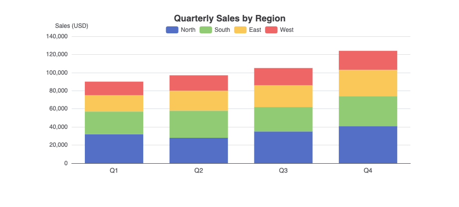
Bar charts (horizontal) and column charts (vertical) are the most versatile chart types, perfect for comparing values across different categories.
Proportional Breakdown
Pie Charts
Best For: Showing parts of a whole, displaying percentages, simple compositions
Sample Prompt: “Create a pie chart showing market share of top 5 smartphone brands”
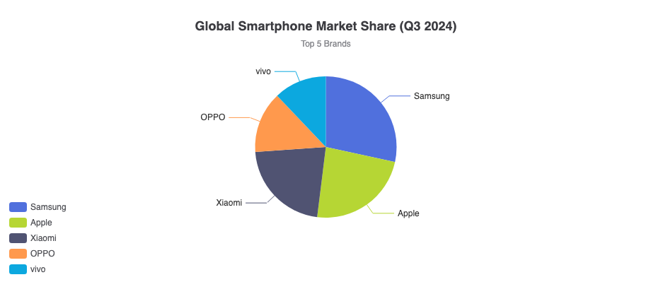
Pie charts work best when you have a small number of categories (ideally 5-7) and want to show how each contributes to 100%.
Doughnut Charts
Best For: Similar to pie charts but with a hole in the center for additional information or aesthetics
Sample Prompt: “Generate a doughnut chart showing the percentage breakdown of a company’s expenses”
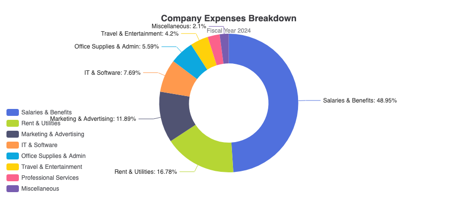
Doughnut charts offer the same functionality as pie charts but with a more modern look and the ability to display a total or label in the center.
Nightingale Rose Charts
Best For: Comparing cyclical data, showing periodic patterns, radial comparisons
These specialized charts display data in a circular format with varying radii, making them excellent for showing seasonal patterns or cyclical trends.
Sunburst Charts
Best For: Visualizing hierarchical data, showing nested relationships, multi-level breakdowns
Sample Prompt: “Generate a sunburst chart visualizing the hierarchical breakdown of website traffic, from traffic source channels down to specific landing pages”
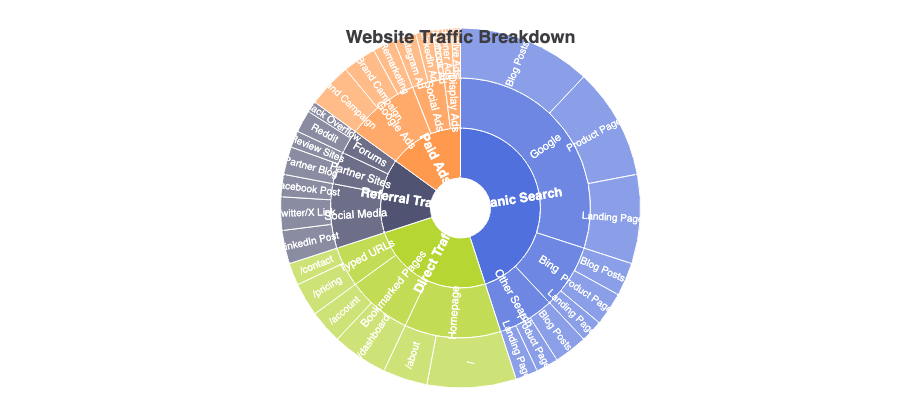
Sunburst charts display hierarchical data as concentric rings, with each ring representing a level in the hierarchy.
Performance & Tracking
Radar Charts
Best For: Comparing multiple variables, showing strengths and weaknesses, profiling
Sample Prompt: “Generate a radar chart showing employee skill levels in a team”
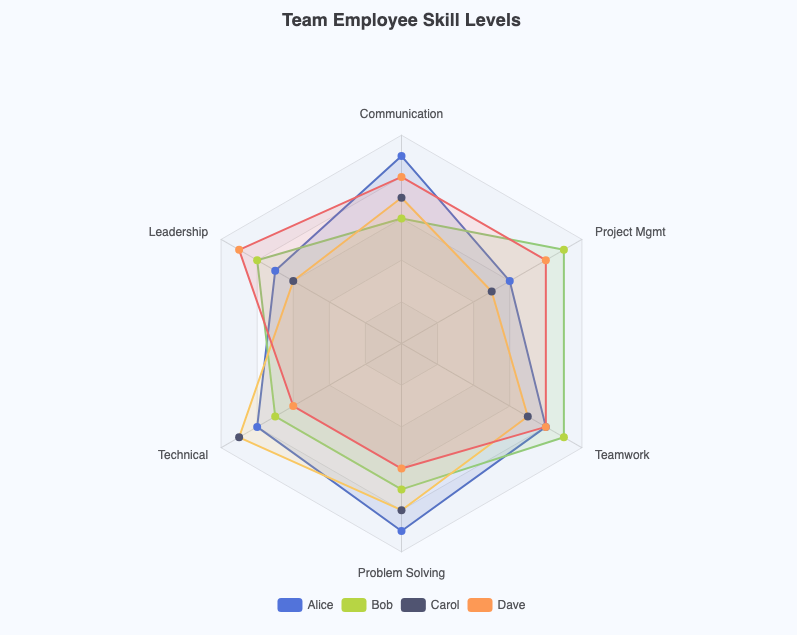
Radar charts (also called spider charts) display multivariate data on axes starting from the same point, making them perfect for comparing profiles or capabilities.
Scatter Plots
Best For: Identifying correlations, finding outliers, showing relationships between two variables
Scatter plots use dots to represent values for two different numeric variables, helping you spot patterns, clusters, and anomalies in your data.
Funnel Diagrams
Best For: Visualizing stages in a process, showing conversion rates, tracking progression
Funnel charts are ideal for sales pipelines, marketing funnels, or any process where items move through sequential stages with decreasing quantities.
Gauge Meters
Best For: Displaying single metrics, showing progress toward goals, KPI dashboards
Gauge charts mimic speedometers or gauges, providing an instant visual indicator of where a value falls within a range.
Advanced Flow & Trends
Sankey Diagrams
Best For: Showing flow and transfer, visualizing energy or material flows, tracking conversions
Sample Prompt: “Generate a Sankey diagram showing the flow of energy from primary sources to end-use”
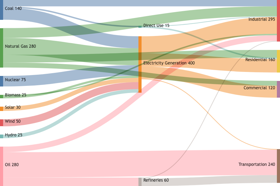
Sankey diagrams use flowing lines with varying widths to show how quantities move between different nodes, making them perfect for visualizing budgets, energy flows, or user journeys.
Theme Rivers
Best For: Displaying changes in composition over time, showing thematic evolution
Theme river charts are specialized area charts that show how different themes or categories evolve and change in proportion over time.
Step-by-Step: Creating Your First Chart
Let’s walk through creating a complete chart from scratch using both the AI Chatbot and VPasCode.
Step 1: Define Your Objective
Before you start, ask yourself:
- What story am I trying to tell?
- Who is my audience?
- What type of chart best represents this data?
- What are the key insights I want to highlight?
Step 2: Generate with AI Chatbot
Visit the AI Chatbot and enter your prompt. For example:
Prompt: “Generate a bar chart showing quarterly sales by region”
The chatbot will generate a chart with sample data that you can use as a starting point.
Step 3: Open in VPasCode
Click the link to open your chart in VPasCode. You’ll see:
- Left Panel: The ECharts configuration code
- Right Panel: The live, interactive chart preview
Step 4: Customize Your Data
Replace the sample data with your actual numbers. For example:
option = {
  title: { text: 'Quarterly Sales by Region' },
  tooltip: { trigger: 'axis', axisPointer: { type: 'shadow' } },
  legend: { data: ['North', 'South', 'East', 'West'] },
  xAxis: { type: 'value', name: 'Revenue (in $1,000)' },
  yAxis: { type: 'category', data: ['Q1', 'Q2', 'Q3', 'Q4'] },
  series: [
    { name: 'North', type: 'bar', stack: 'Total', data: [85, 120, 95, 150] },
    { name: 'South', type: 'bar', stack: 'Total', data: [65, 90, 110, 130] },
    { name: 'East',  type: 'bar', stack: 'Total', data: [45, 70, 85, 100] },
    { name: 'West',  type: 'bar', stack: 'Total', data: [30, 50, 60, 75] }
  ]
};
Step 5: Format Your Code
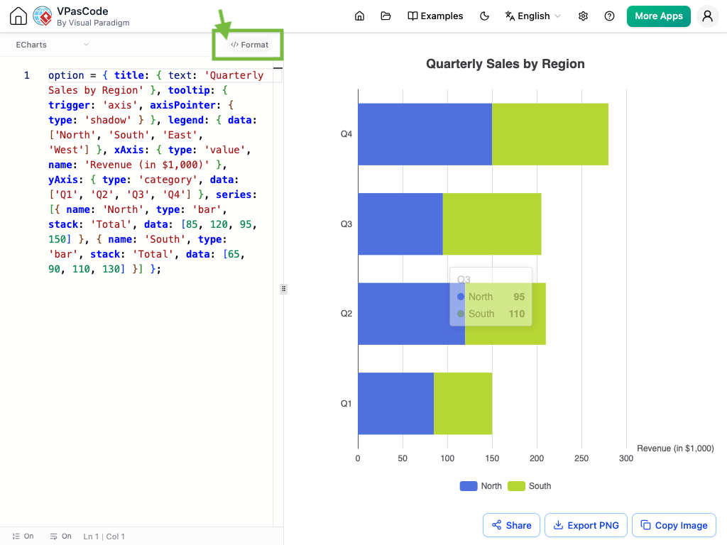
If your code becomes cluttered or hard to read, use the Format feature. Click the </> Format button at the top of the editor to instantly organize your script into clean, standard indentations.
Before Formatting:
After Formatting:
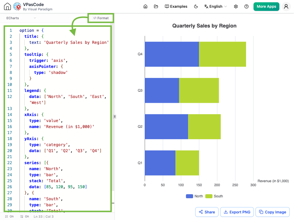
Every attribute is clearly listed on its own line, giving you total visibility over your chart’s structure and making it effortless to locate and update labels, series data, or styling rules.
Step 6: Customize Styling
Change colors, fonts, and other visual elements:
series: [{
  name: 'Visits',
  type: 'line',
  smooth: true,
  data: [820, 932, 901, 934, 1290, 1330],
  areaStyle: {
    color: '#ff6b6b',
    opacity: 0.3
  },
  lineStyle: { color: '#e03131' },
  itemStyle: { color: '#e03131' }
}]
Step 7: Share or Export
Once satisfied, copy the shareable URL or export your chart for use in presentations, reports, or web applications.
Editing and Customizing Charts in VPasCode
Understanding the ECharts Configuration Structure
Every chart in VPasCode follows a standard structure. Let’s break down the key components:
1. Title Configuration
title: {
  text: 'Your Chart Title',
  left: 'center'  // Position: 'left', 'center', 'right'
}
2. Tooltip Settings
tooltip: {
  trigger: 'axis',        // 'item', 'axis', 'none'
  axisPointer: {
    type: 'shadow'        // 'line', 'shadow', 'none'
  }
}
3. Legend Configuration
legend: {
  data: ['Series 1', 'Series 2'],
  bottom: 10  // Position: 'top', 'bottom', 'left', 'right'
}
4. Axis Configuration
xAxis: {
  type: 'category',       // 'category', 'value', 'time'
  data: ['Jan', 'Feb', 'Mar'],
  name: 'Month'
},
yAxis: {
  type: 'value',
  name: 'Revenue'
}
5. Series Definition
series: [{
  name: 'Sales',
  type: 'bar',            // 'bar', 'line', 'pie', etc.
  data: [120, 200, 150],
  stack: 'Total',         // For stacked charts
  areaStyle: { opacity: 0.3 }  // For area charts
}]
Advanced Customization Techniques
Adding Grid Controls
grid: {
  left: 40,
  right: 20,
  top: 50,
  bottom: 30,
  containLabel: true
}
Customizing Colors
color: ['#ff6b6b', '#4ecdc4', '#45b7d1', '#96ceb4']
Adding Visual Maps
visualMap: {
  min: 0,
  max: 30,
  type: 'continuous',
  orient: 'horizontal',
  left: 'center',
  bottom: '15%'
}
Real-World Examples and Templates
To help you get started quickly, here are production-ready examples for common scenarios:
1. Regional Sales Analysis (Stacked Bar Chart)
Perfect for looking at absolute totals across groups while breaking down categorical distributions simultaneously.
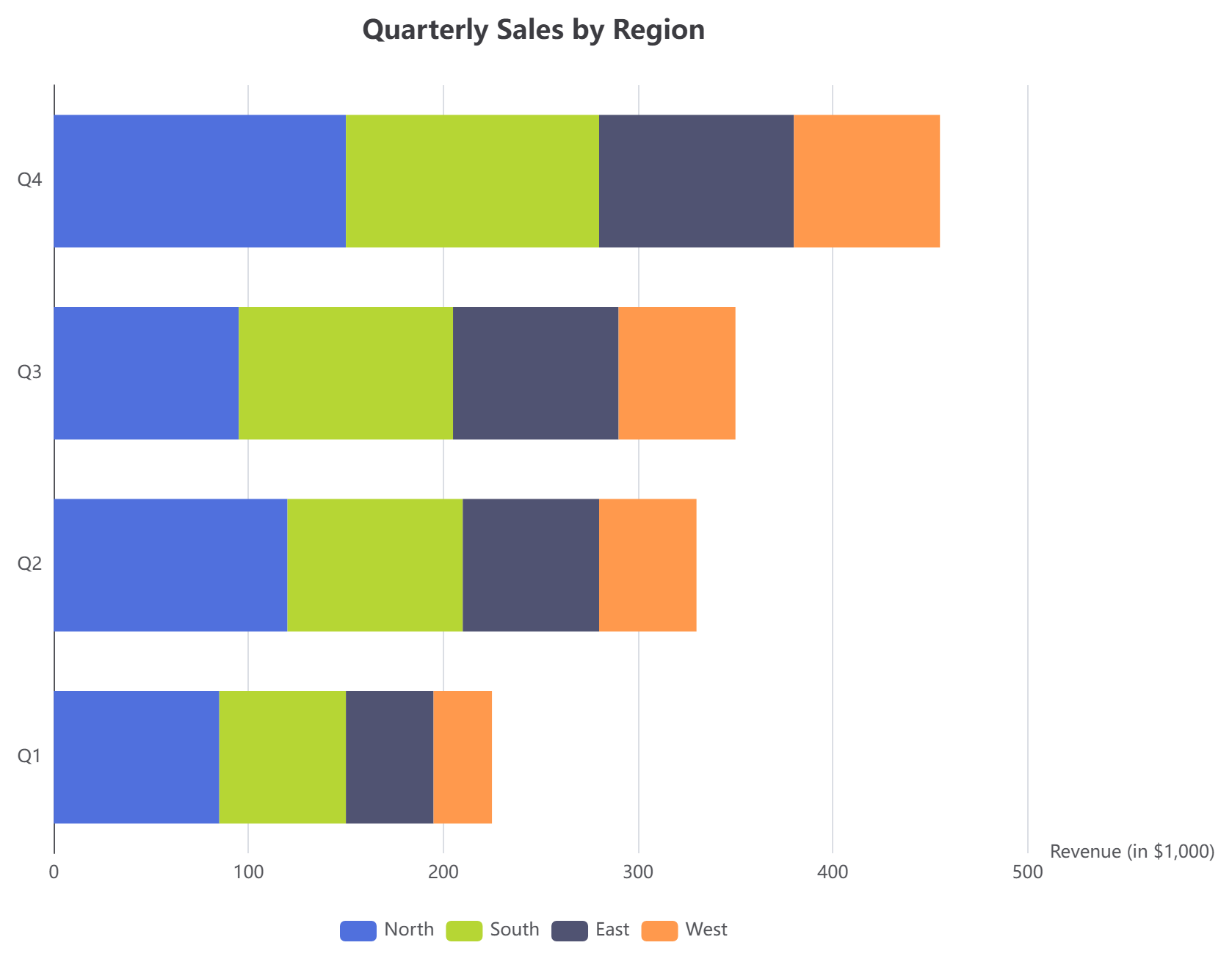
This chart shows quarterly performance across different regions, with each bar stacked to show individual contributions.
2. Monthly Website Growth (Line Chart with Shaded Area)
Designed for tracking chronological shifts with smooth interpolations and clean grid alignments.
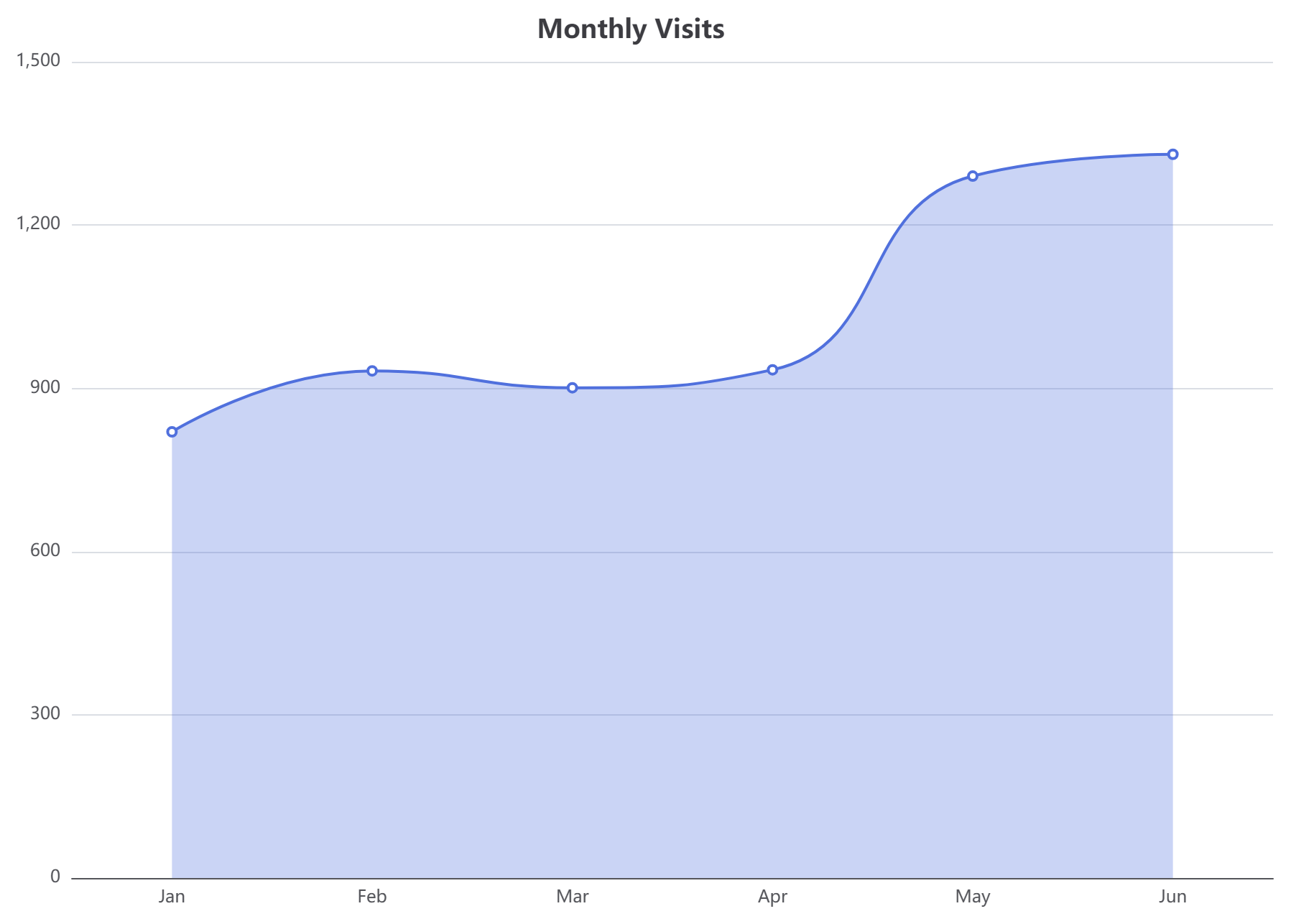
The shaded area emphasizes volume and makes trends more visually apparent.
3. Traffic Referral Mix (Interactive Pie Chart)
A classic layout for computing relative market share or traffic sources, complete with a clean bottom legend container.
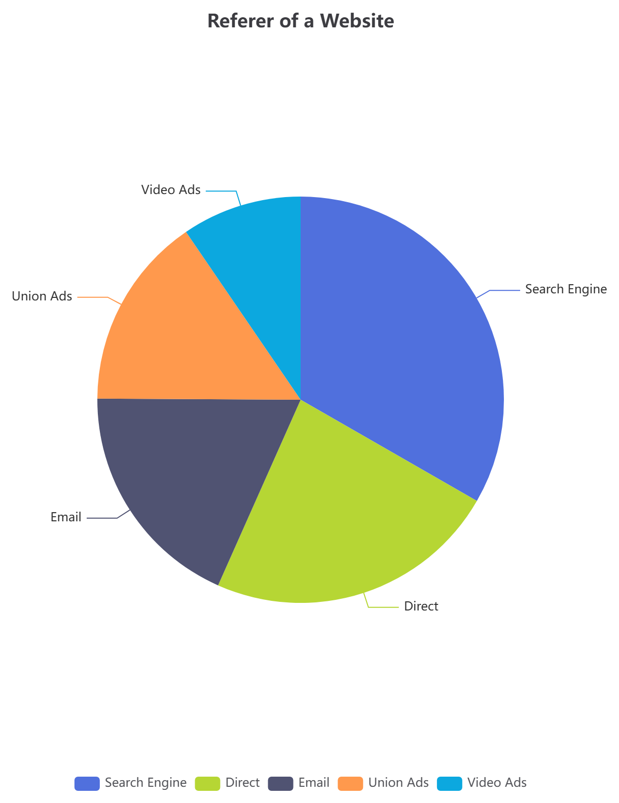
This chart helps you quickly identify which channels drive the most traffic.
4. Service Mesh Architecture Comparison (Radar Chart)
A multivariate graph structure often used to evaluate technical capabilities, software benchmarks, or complex architecture criteria side-by-side.
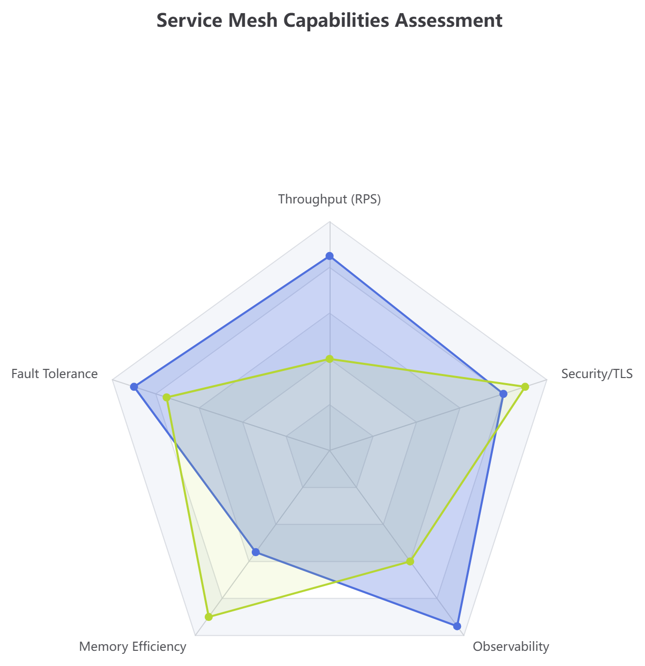
Compare multiple systems across various performance dimensions in a single view.
5. Inference Latency Metric Profile (Scatter Plot)
Great for identifying outlier spikes, payload sizing thresholds, and application bottlenecks across distributed infrastructures.
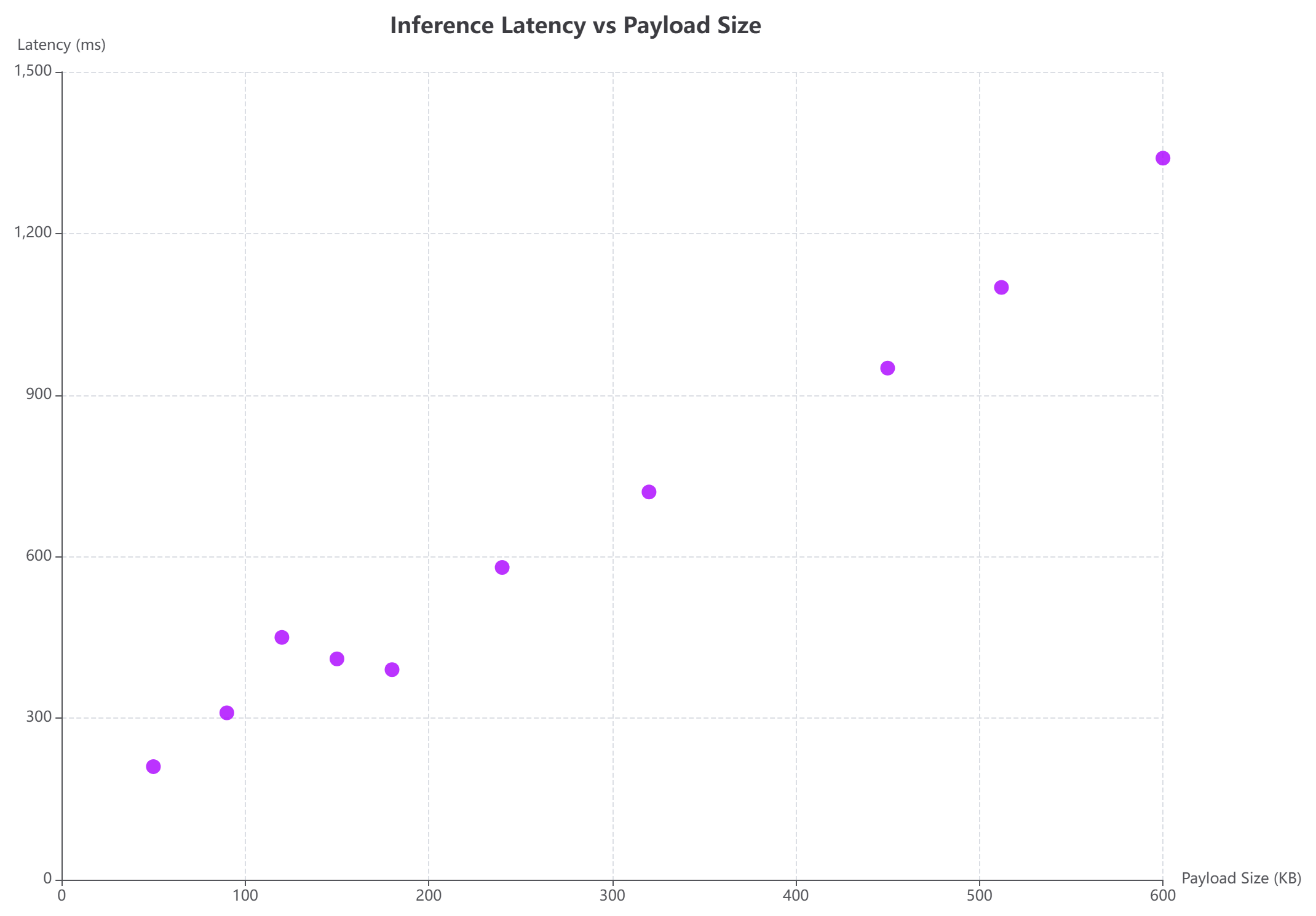
Each dot represents a data point, making it easy to spot correlations and anomalies.
6. Multi-Level Codebase Licensing (Sunburst Chart)
Visualize hierarchical relationships with concentric rings. This chart maker simplifies complex nested data configurations.
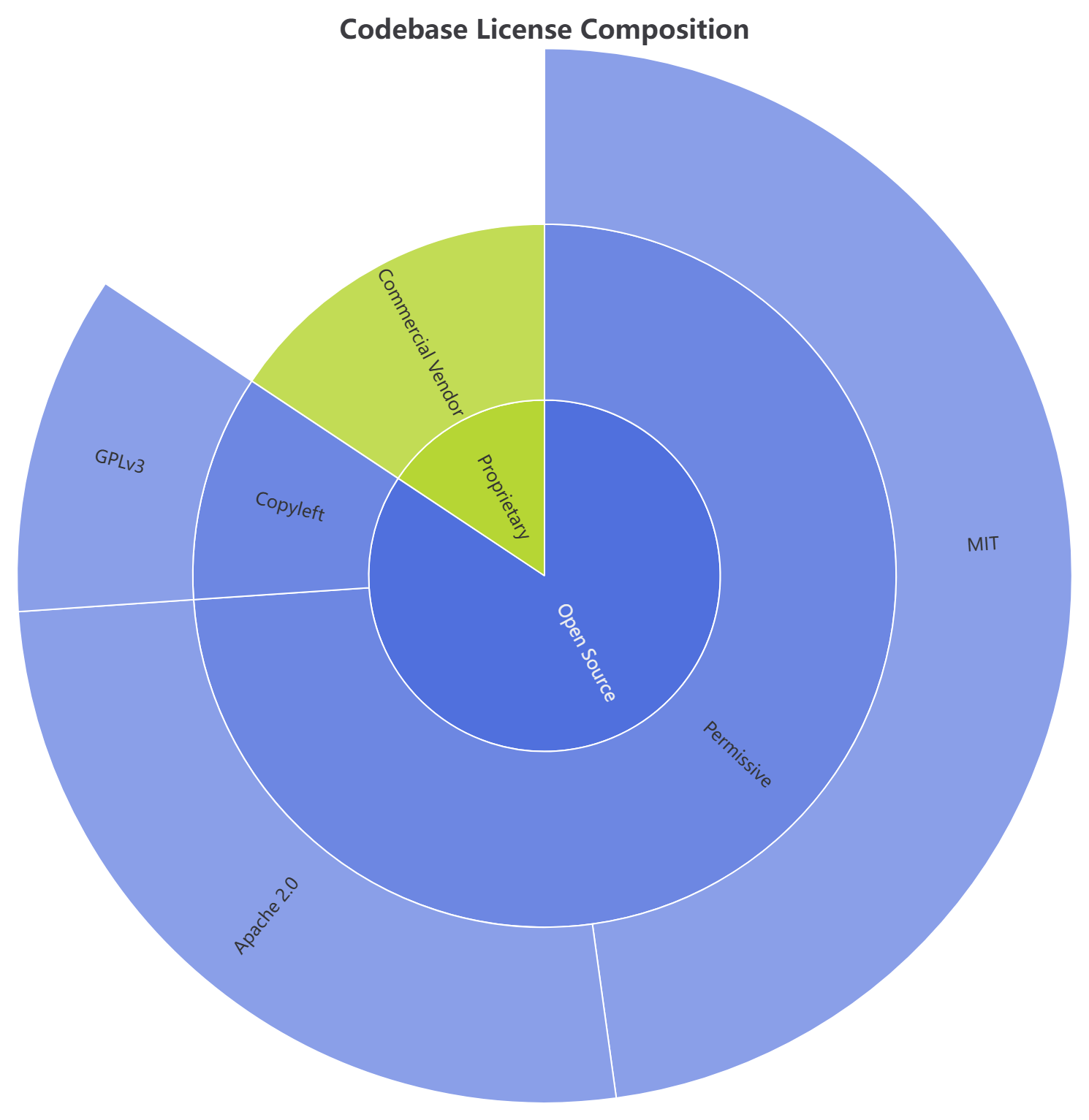
See how different license types break down across your codebase hierarchy.
7. Infrastructure Cost Flow Analyzer (Sankey Diagram)
Trace operational resource mapping or financial variables across computational steps with flowing node weight links.
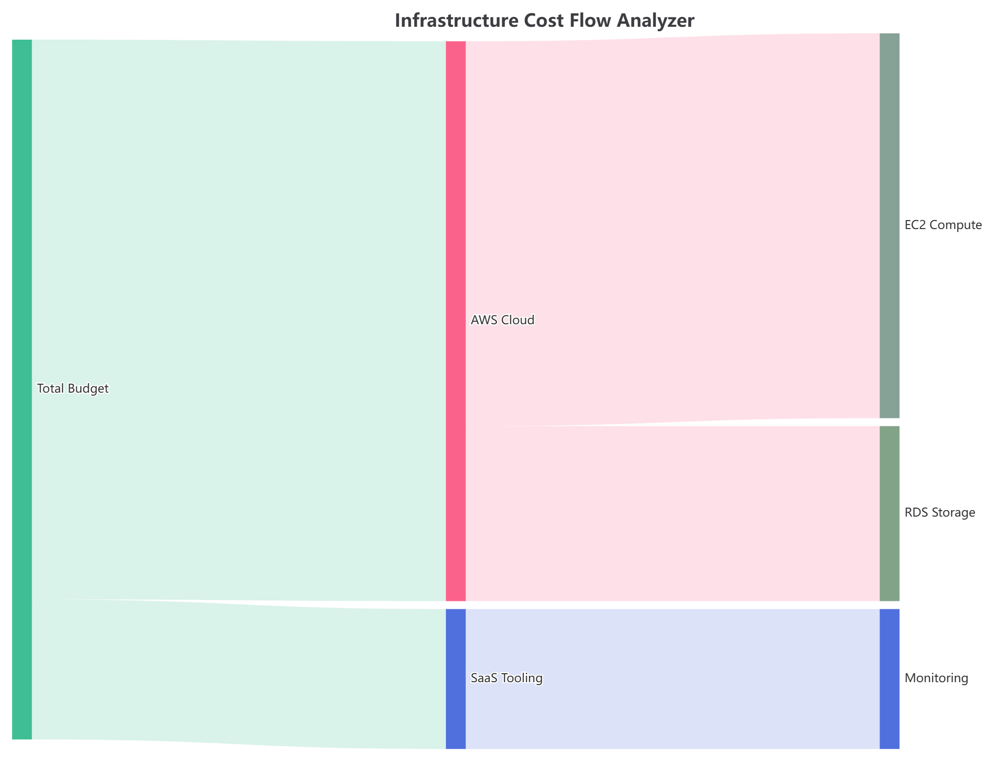
Follow how budget flows from total allocation to specific services and components.
8. Hourly Deployment Velocity Grid (Heatmap)
Monitor systemic densities, deployment volumes, or continuous traffic shifts across custom timeframe matrices easily.
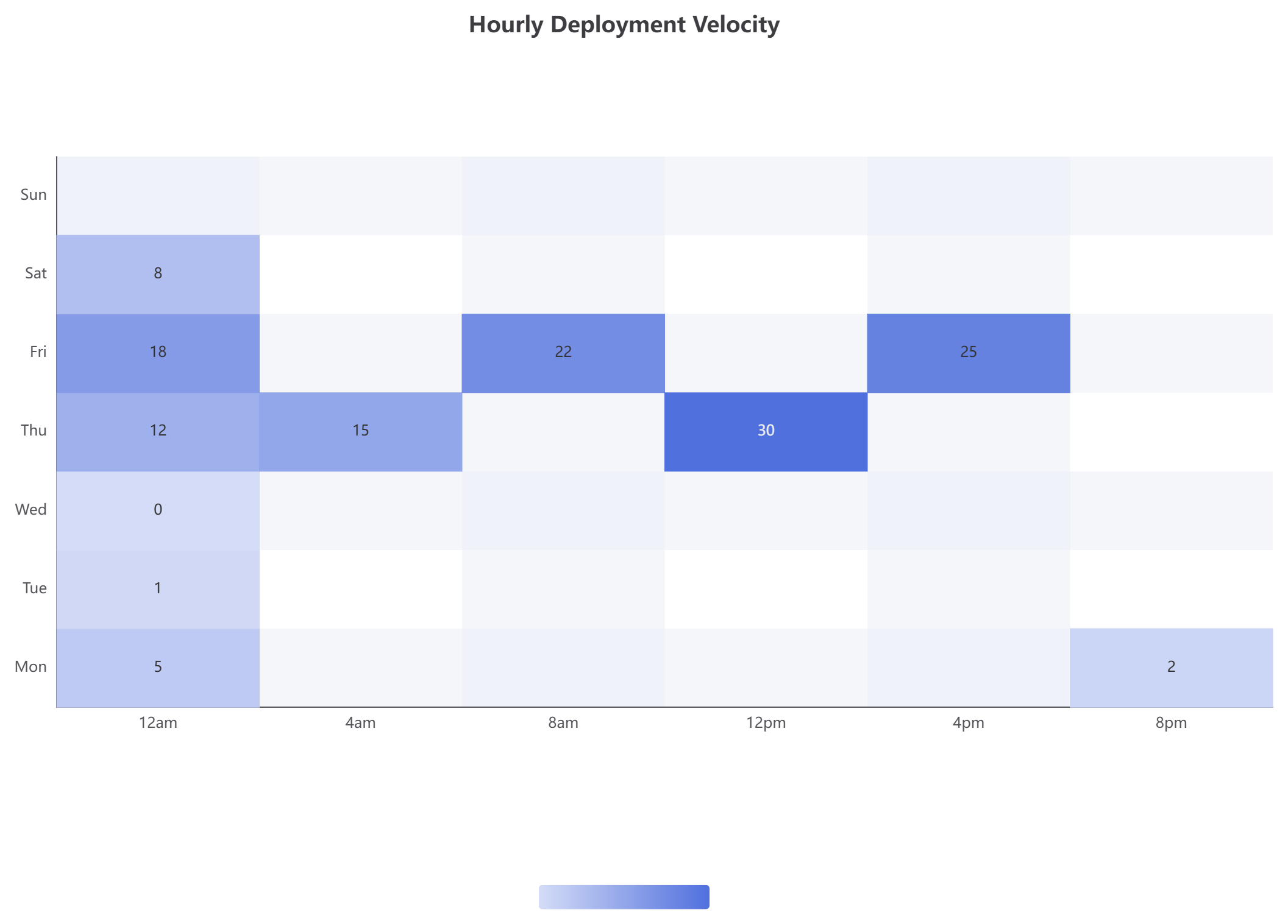
Identify patterns in deployment frequency across different days and times.
Code Formatting Best Practices
Why Formatting Matters
When working with complex chart scripts, readability is everything. Squeezing multiple attributes onto a single line makes it easy to miss details or make editing mistakes. With VPasCode’s formatting tool, your code structure is transformed instantly:
- Nothing Hidden: Every attribute is clearly listed on its own line, giving you total visibility over your chart’s structure.
- Effortless Editing: Quickly locate and update labels, series data, or styling rules without hunting through packed lines of code.
- One-Click Cleanup: Simply click the
</> Formatbutton at the top of the editor to instantly organize your script into clean, standard indentations.
Formatting Example
Before (Compressed):
option = { title: { text: 'Quarterly Sales by Region' },
tooltip: { trigger: 'axis', axisPointer: { type: 'shadow' } },
legend: { data: ['North', 'South', 'East', 'West'] },
xAxis: { type: 'value', name: 'Revenue (in $1,000)' },
yAxis: { type: 'category', data: ['Q1', 'Q2', 'Q3', 'Q4'] },
series: [{ name: 'North', type: 'bar', stack: 'Total', data: [85, 120, 95, 150] },
{ name: 'South', type: 'bar', stack: 'Total', data: [65, 90, 110, 130] }] };
After (Formatted):
option = {
  title: {
    text: 'Quarterly Sales by Region'
  },
  tooltip: {
    trigger: 'axis',
    axisPointer: {
      type: 'shadow'
    }
  },
  legend: {
    data: ['North', 'South', 'East', 'West']
  },
  xAxis: {
    type: 'value',
    name: 'Revenue (in $1,000)'
  },
  yAxis: {
    type: 'category',
    data: ['Q1', 'Q2', 'Q3', 'Q4']
  },
  series: [
    {
      name: 'North',
      type: 'bar',
      stack: 'Total',
      data: [85, 120, 95, 150]
    },
    {
      name: 'South',
      type: 'bar',
      stack: 'Total',
      data: [65, 90, 110, 130]
    }
  ]
};
See how much easier formatted code is to work with? Every nested object and array is properly indented, making it simple to understand the structure at a glance.
Tips for Success
1. Start Simple
Begin with basic chart types like bar or line charts before moving to complex visualizations like Sankey diagrams or sunburst charts.
2. Use Descriptive Prompts
The more specific you are with the AI Chatbot, the better your results. Include:
- Chart type
- Data categories
- Time periods
- Specific metrics
3. Validate Your Data
Always double-check that your numbers are accurate and that categories match your data labels.
4. Consider Your Audience
Choose chart types that your audience will understand. Not everyone is familiar with radar charts or Sankey diagrams.
5. Keep It Clean
Avoid cluttering charts with too much information. If you have multiple stories to tell, create multiple charts.
6. Use Color Purposefully
Colors should enhance understanding, not distract. Use consistent colors for the same categories across different charts.
7. Test Interactivity
If you’re creating interactive charts, test all hover states, tooltips, and click behaviors to ensure they work as expected.
8. Save Your Work
Use the shareable URL feature to save different versions of your charts. This makes it easy to return to previous iterations or share specific versions with collaborators.
Troubleshooting Common Issues
Chart Not Rendering
- Check for syntax errors in your JSON configuration
- Ensure all brackets and commas are properly placed
- Verify that your data arrays match the expected format
Data Not Displaying Correctly
- Confirm that your xAxis and yAxis types match your data
- Check that series data arrays have the correct number of values
- Verify that category names match exactly (case-sensitive)
Colors Not Applying
- Ensure color values are in valid formats (#hex, rgb(), or named colors)
- Check that you’re applying colors to the correct properties (itemStyle, lineStyle, areaStyle)
Tooltips Not Working
- Verify that the tooltip trigger is set correctly (‘item’ for pie charts, ‘axis’ for bar/line charts)
- Ensure your series have name properties defined
Conclusion
Creating professional, interactive charts no longer requires expensive software or advanced programming skills. With the combination of Visual Paradigm’s AI Chatbot and VPasCode’s powerful ECharts integration, you have everything you need to transform raw data into compelling visual stories.
The workflow is simple yet powerful:
- Start with AI: Use natural language to generate your initial chart instantly
- Refine with Code: Open in VPasCode to customize data, styling, and behavior
- Format for Clarity: Use the one-click formatting tool to keep your code clean and maintainable
- Share and Collaborate: Generate shareable URLs for easy collaboration and presentation
Whether you need to create a simple bar chart showing monthly sales trends, a complex Sankey diagram tracking energy flows, or an interactive radar chart comparing team performance, this AI-powered chart maker gives you the flexibility to create exactly what you need.
The examples and templates provided in this guide demonstrate just a fraction of what’s possible. From heatmaps showing deployment velocity to sunburst charts visualizing hierarchical data structures, ECharts combined with VPasCode opens up endless possibilities for data visualization.
Stop settling for rigid, uneditable AI images or spending hours manually adjusting pixels in traditional charting tools. Experience the power of a flexible chart maker that adapts to your actual business needs. Bring your ideas to life instantly with AI Chatbot chart generation, and freely edit the data and style using VPasCode.
Your data has a story to tell. Now you have the tools to tell it beautifully.
References
- AI Chart Generation: Create with Chatbot, Edit with VPasCode: Discover how to combine AI-powered instant chart creation with code-based editing flexibility for complete control over your data visualizations.
- VPasCode Overview: Explore the unified text-to-diagram platform that supports Mermaid, PlantUML, Graphviz, and ECharts in a single integrated environment.
- Diagram-as-Code Tool: Learn about Visual Paradigm’s innovative approach to creating diagrams and charts through code for precision and version control.
- VPasCode Live Editor: Access the interactive editor to create, customize, and share ECharts visualizations with real-time preview and one-click formatting.
- AI Toolbox Chatbot: Try sample chat sessions demonstrating how to generate bar charts, line charts, pie charts, and more using natural language prompts.
Related posts:
 From Static Diagrams to Living Knowledge: A Case Study on Visual Paradigm’s Unified AI-Driven Documentation Ecosystem
 The Complete Guide to AI-Powered UML Diagram Generation
![How to Model Constraints in UML? [With Examples]](https://www.archimetric.com/wp-content/uploads/2026/04/uml-constraint-example.png "How to Model Constraints in UML? [With Examples]") How to Model Constraints in UML? [With Examples]
How to Model Constraints in UML? [With Examples]
 Comprehensive Guide: UML Diagrams with AI and Agile Teams Using Visual Paradigm

 English
 Arabic
 Chinese (Simplified)
 Dutch
Dutch French
 German
 Italian
 Japanese
 Korean
 Portuguese
 Russian
 Spanish